brevix
Account Opening Journey for Credit Unions
INDUSTRY
US Banking
CLIENT
CRM software serving banks and credit unions
TEAM
1 UX Lead, 2 UX /UI Designers, 1 Project Manager
MY ROLE
UX/UI Designer
DEVICE
Desktop & Mobile

Overview
Brevix is a CRM platform that bank and credit unions reps used to open new customer accounts. The tool worked, but a single account opening took 30 minutes to over an hour. Customers walked out before signing. Reps blamed themselves for software that was never designed for the human moment they were trying to create.
We redesigned the branch-led journey and build a clean experience on top of a legacy core banking system.
1.Discovery
1.1 Industry Understanding
Banks and credit unions are not the same
A bank identifies customers by SSN, and the SSN is usually unique. A credit union identifies people by a Member ID. One person can hold multiple Member IDs, one for personal accounts, one as a trustee.
Account opening is not one journey, it's several
A new walk-in is different from an existing member adding a new account. A joint account with three signers is different from an individual checking.
The CRM is not the source of truth. The core banking system is.
The CRM is a front-end that talks to the core through APIs. The core's API structure decides what the CRM can and can't do at the filed level.
1.2 The Existing Product

In the workshop, we reviewed the existing product screen by screen with the client’s senior business leaders, identifying problems and failure points along the way. The product had twelve separate screens from the moment a customer approached the desk to the point where the account was opened.
Primary persona: The Bank Representative

Jane Cooper
Bank
Representative
55 Yrs
3 to 8 account openings per day,
alongside other branch tasks
Needs and goals
Onboard the customer with the correct paperwork
Cross-sell and upsell where appropriate
Establish and deepen the long-term relationship with the customer
Pain points
No reference documents to verify entered data against an authoritative source
Document generation and retention runs through a third-party tool, breaking the journey's continuity
The rep has to manually check every account-opening document for the customer's signature, no integrated status from the e-sign vendor
No field-level validations or help text
Product documents are not well categorized, making it time-consuming and confusing to select the right ones
No way to exit the journey gracefully when something goes wrong
No auto-refresh for the account title after changes are made to the product-relation table
Expectations from the product
The product should handle the case where multiple representatives work on a single onboarding (resumability across reps)
Accessible design is a baseline requirement, not a nice-to-have
Provision for data validation if required for customer details (e.g. OCR support)
Smart suggestions for products to cross-sell or upsell, based on the bank's product sales targets
The rep should be able to edit existing customer data points that are autofilled, not just accept them
1.3 Persona
Persona work was collaborative. The senior business leaders provided the raw observations. Our team structured those observations into a single, primary persona.
2. Define
2.1 Information Architecture
The existing product had a flat, twelve-step linear wizard with no concept of grouping. We restructured the journey into four major stages.

Why group twelve steps into four stages?
Because reps in the existing product had no mental model of where they were in the journey. The flat wizard at the top of the screen had so many stages it wrapped onto a second line.
Why is this the most important IA decision?
Because once the journey was grouped this way, nearly every other decision became easier. Where to place global actions. Where to allow back-navigation. Where to lock state. What to show on the wizard.
2.2 Visual Direction
I led the visual direction. The brief was simple: calm, trustworthy, professional.
The Wizard Header: V1, V2
One of the smallest components on the screen, we tried three concepts.

A single horizontal row showing all twelve original steps.
What worked: familiar to existing users.
What didn't: sub-steps stayed invisible until walked into.

Four stages, each with a small progress dot indicator showing how many sub-steps were completed.
What worked: a tiny dot indicator showing how many sub-steps were inside the stage and how many were done.
Develop
I owned the screen-level design decisions across the journey. UI execution was paired with the UI Designer.
The team worked in loops.
Mid-fidelity wireframes in Figma for structure and IA.
High-fidelity mockups for visual decisions and component behaviour.
Stakeholder reviews happened at the end of each loop, with senior leaders present.
Below, four screens that carried the most consequential decisions.

The Member Discovery
The first screen of the journey, every account opening starts here and to recover a half-finished journey from an earlier visit happens here.
1. Single SSN Search in entry screen
The existing product asked four questions before searching.
2. Five result types, each with its own action.
The action a rep takes differs by type:
-
existing members get selected
-
leads get converted
-
pending journeys get resumed
-
third-party records get continued with auto-fill
-
rejected journeys get overridden with reason
3. Show every match. Differentiate visually with photo, name, type tag, and source.
4. A "Pending Journey" and “Leads” surfaced as a top-level result type, not a hidden state.
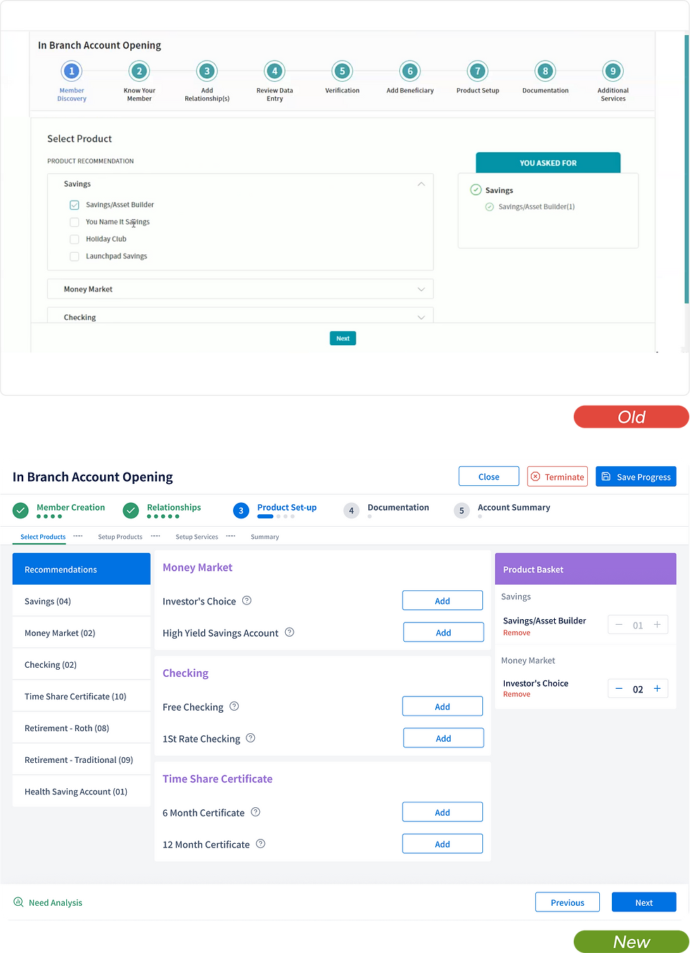
The Product Selection screen
The product selection screen in the existing product was a checkbox checklist. Categories on the left, products underneath, a basket on the right. No recommendations, no offers, no signal of what the bank already knew about the customer.
Three-zone layout
The screen was restructured into three areas:
what the customer asked for (left)
what we'd recommend (centre)
the cart (right)
The Final Designs
Design System

Reduction in average account opening time
Change in document-error rates
Change in rep training duration
Change in customer abandonment rates
Outcomes
Outcomes are partially known. What I'm holding back from this project.