Designing a loyalty experience that builds lasting brand habits
INDUSTRY
Brewing
CLIENT
AB INBev
TEAM
Design Lead (me), 1 Researcher, 1 UX Designer,
2 UI, 1 Project Manager
PLATFORM
Mobile App
The loyalty app developed for AB InBev is designed to strengthen consumer engagement and encourage repeat purchases across its beer brands.
The platform rewards users for their purchases by allowing them to scan QR codes or bills to earn points, which can be redeemed for discounts, merchandise, lifestyle rewards, or curated experiences. A tier-based system further recognizes loyal consumers with exclusive offers, personalized rewards, and access to special events.


discovery insights
the two personas
Premium consumers
21–30 years old
Income 10-25 lakhs.
Lives in metro, Tier 1, or Tier 2 cities
Heavy media user.
Active on social, influenced by peers and Gen Z trends.
Drinks frequently.
Wants personalised offers, deals, occasion-based rewards, and content that's shareable.
Super-premium consumers
25–34+ years old.
Income 25 lakhs+.
Lives in metro and Tier 1 cities.
Travels internationally.
Drawn to high-end fashion, exotic cuisines, luxury brands.
Wants unique experiences, exclusive offerings, limited drops, badge value, and rewards that feel crafted rather than generic.
key behavioral insights
-
Consumers constantly browse brands online.
-
Consumers actively wait for offers before buying.
-
Consumers already understand loyalty programs well.
emotional value of loyalty programs
-
Recognition Consumers feel acknowledged when brands reward them
-
Exclusivity invitation-only access
-
Connection with the Brand Programs strengthen emotional bonding with brands.
competitor analysis


Onboarding wasted the first session.
Bira91 and Drnko both forced full KYC at registration. Email, password, ID upload, photo, all before the user saw anything. Starbucks did the opposite. Quick sign-up, free browsing, KYC only when the user wanted to redeem something.
Splash screens didn't sell the app.
None of the three did a good job here.
One used text-heavy carousels, other how to use the app.
Visually Showcase Rewards
Drnko present rewards in plain lists or text-heavy layouts, which reduces excitement.
Home screens hid tier status
Bira91 and Drnko didn't show the user's tier on the home screen. Neither showed progress to the next one
Reward mechanics could incentivise drinking
Bira91 awarded six points per scan regardless of pack size, and capped daily scans at five.
The UI direction focuses on creating a bold, vibrant, and energetic interface that aligns with the lifestyle of premium and super-premium consumers.
Overall, the approach balances strong visual personality with clarity, creating an experience that feels premium, engaging, and easy to interact with.
secondary
#000000
tertiary
#FF4900
tertiary
#00EE72
tertiary
#F3FF06
primary
#59C3C9
design direction
Onboarding without KYC up front
Bira91 and Drnko both required heavy registration. Starbucks did the opposite, quick sign-up
WHY: The first model drops users early. The second model makes the friction make sense.

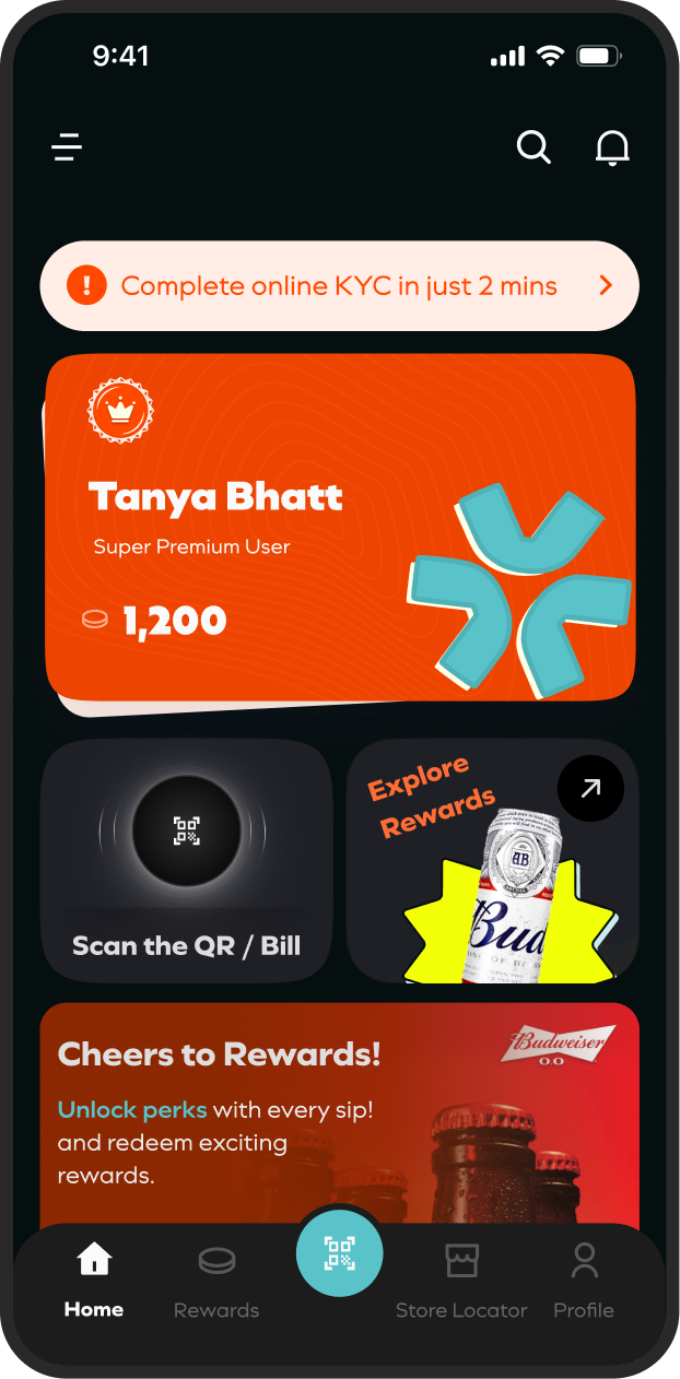
Tier status on the home screen
Neither Bira91 nor Drnko showed the user's tier on the home screen. Neither showed progress to the next one. Starbucks did both, and added one more thing that mattered.
WHY: Because customers in both personas told us they got lost in points systems where they couldn't see their own progress.
Instant Reward Experience
Scan → Earn → Redeem quickly
The user scans a bottle cap or can tab, the points land instantly in the same screen


Splitting the rewards catalogue
The rewards catalogue splits into All and Redeemed with category chips and a filter to narrow further. The detail view brings cost, validity, and benefits together under one Redeem Now CTA.


